If you are about to download an LED scroller app, the easiest mistake is choosing one that looks flashy in screenshots but feels awkward the moment you actually try to use it. That happens a lot in this category.
The better approach is to judge the app by what helps you create a clear visible message quickly. In practice, that usually matters much more than novelty effects.
That is also where LED Scroll Display fits best. It is built around the core outcome people want from this kind of app: type a message, make it readable, and show it fullscreen without friction.
If you only want the short version, look for fullscreen mode, fast editing, readable text controls, speed settings, and a workflow that feels useful in real life, not just in a store listing.
Table of contents
- What most people actually want from an LED scroller app
- The most important features to check before downloading
- Warning signs that an LED scroller app may be disappointing
- How to judge app quality in a few minutes
- Why LED Scroll Display is a strong option
- A practical download checklist
- FAQ
What most people actually want from an LED scroller app
Most people are not looking for a novelty app they will open once and forget. They want a quick tool that helps them turn their phone into a visible sign.
That usually means one or more of these situations:
- making a pickup sign
- showing a message at an event
- displaying a short shop or counter notice
- creating a birthday or party banner
- communicating in a noisy place
Once you view the category that way, the decision gets easier. The best LED scroller app is not the one with the longest feature list. It is the one that helps you get a readable result fast.
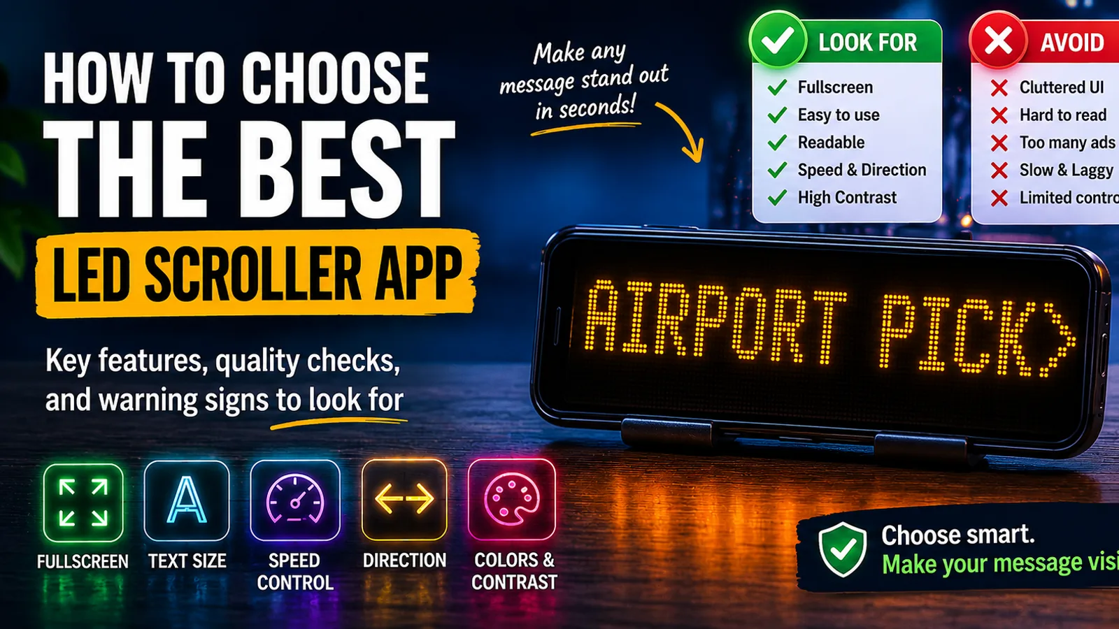
The most important features to check before downloading
If you want to avoid wasting time, these are the features worth checking first.
Fullscreen mode
This is the first non-negotiable feature.
Without fullscreen mode, the message usually feels smaller, more cluttered, and less useful in real scenarios. A proper LED scroller app should make the phone screen behave like a sign, not like a text editor with extra chrome around it.
Fast message editing
You should be able to open the app and create a visible message quickly.
That matters because many common use cases are spontaneous:
- you have arrived at the airport
- you suddenly need a sign at an event
- you want a short message for a counter
- you need to communicate without speaking
If the app slows you down before the text is even visible, it is already losing.
Text size and readability controls
An LED scroller app only works if people can read the message easily.
Look for:
- large text support
- clear font rendering
- readable spacing
- simple visual controls
This matters more than decorative styling because visibility is the core job.
Speed control
Scrolling text that moves too fast becomes useless immediately.
A good app makes it easy to slow the message down enough to read in one pass. This is especially important for:
- pickup names
- short instructions
- promotional messages
- crowd communication
Direction settings
Not every message works best with the same movement. Direction control makes the app more flexible and helps different messages feel more intentional.
Color, background, and contrast options
Brightness alone is not enough. You want combinations that stay visible in real environments.
High contrast usually matters more than fancy styling, especially in:
- airports
- stations
- nighttime use
- crowded indoor venues

Warning signs that an LED scroller app may be disappointing
It is often easier to spot a bad choice by looking for the wrong signals.
Be careful if the app seems focused on:
- visual effects but not readability
- cluttered controls
- slow setup
- weak fullscreen presentation
- hard-to-find basic settings
The same applies if the app feels like it was designed to look fun in screenshots rather than work smoothly when you actually need it.
An LED scroller app should feel practical first. Effects are fine, but they should not get in the way of the message.
How to judge app quality in a few minutes
You do not need a long testing process. A quick real-world check usually tells you enough.
1. Type a short message
Use something simple like:
AIRPORT PICKUPMEET HEREWELCOME LUCASOPEN NOW
If even this first step feels clumsy, the app is probably not a great choice.
2. Switch to fullscreen mode
This is the fastest quality test.
If the fullscreen result feels clean, bold, and easy to read, that is a strong sign. If it still looks cramped or awkward, the app may not hold up well in real use.
3. Change the speed and text size
These are two of the most practical controls in the whole category.
If they are hard to find or slow to adjust, the app will become annoying at exactly the wrong moments.
4. Check whether the app would be useful again
This is an underrated filter.
Would you keep the app installed for future pickups, events, birthdays, counters, and quick signs? If the answer is yes, the workflow is probably doing something right.
If you want the practical companion guide after this, How to Make Scrolling Text on Your Phone in Minutes is the best next read.
Why LED Scroll Display is a strong option
LED Scroll Display works well because it focuses on the parts that actually matter when people are deciding whether an LED scroller app is worth keeping.
It helps you:
- type a message quickly
- make it readable
- adjust speed and direction
- change colors and styling
- switch to fullscreen without friction
That combination is what turns the app from a gimmick into a useful tool. It also makes it practical across multiple scenarios instead of only one narrow use case.
This is especially relevant if you are deciding between a dedicated app and a workaround like Notes. If that question is still open for you, Scrolling Text vs Notes App: Which Is Better for Visible Messages? covers that tradeoff directly.
A practical download checklist
If you want the shortest possible checklist before installing an LED scroller app, use this:
- can I type a message fast?
- can I show it fullscreen immediately?
- can I make it easy to read?
- can I control speed and direction easily?
- does it look useful in real situations, not just in screenshots?
If the answer is yes to those five questions, the app is probably a strong option.
If the answer is no to several of them, keep looking.
A simple recommendation before you download
If your goal is to find an LED scroller app that is genuinely useful, judge it by clarity, speed, and ease of use first.
LED Scroll Display is a strong fit for that because it focuses on readable results, practical controls, and a fullscreen workflow that makes sense in pickups, events, counters, parties, and quick visible communication.


If you want the fastest decision rule, ignore the flashy extras for a moment and ask one question: does this app help me create a bold readable message quickly? That is what matters most in real use.
FAQ
What should an LED scroller app have?
A good LED scroller app should have fullscreen mode, fast message editing, readable text controls, speed and direction settings, strong contrast options, and an easy workflow.
Are all LED scroller apps basically the same?
No. Some are smooth and practical, while others focus too much on effects and not enough on visibility, speed, or ease of use.
What matters more: effects or readability?
Readability matters more. Effects can help presentation, but the message needs to be easy to see and easy to read first.